Reflecting on how effective packaging should function, one automatically thinks of qualities such as strength, lightness and sustainability. While these are certainly essential, accessibility isn’t far behind in importance.
The supermarket shelf belongs to all of us, and colours, fonts and design are key to enhancing the shopping experience. These elements let you understand the properties of a product at a glance — whether you’re in France, Portugal, Italy or Spain. And indeed, beyond aesthetics, a bit of packaging and design are essential in aiding the user’s decision in a simple, highly visual manner.
Information is power and, undoubtedly, one of the keys to being able to buy responsibly and in line with our lifestyle. For this reason, it is essential that it be comprehensible to everyone.
Seeing is believing:
information at first sight
What the eyes don’t see, the heart doesn’t feel.This classic Spanish proverb is clearly borne out by the relationship between consumer satisfaction and packaging legibility.
According to the Spanish Agency for Food Safety and Nutrition (AESAN), information such as the name of the food, its ingredients, allergens, net quantity, best-before date and expiry date must appear on the label in a clear and legible manner. How? With a font size greater than 1.2mm, or 0.9mm for packaging with a maximum surface area of less than 80cm2. Contrast and choice of colour are also essential for people with vision difficulties or colour blindness to be able to see it without difficulty.
ISO symbols: an easy, universal language
Beyond colour and typography, graphic design and (more specifically) pictograms are able to provide information about a product’s capabilities using a language that can be understood in all corners of the world.
For example:
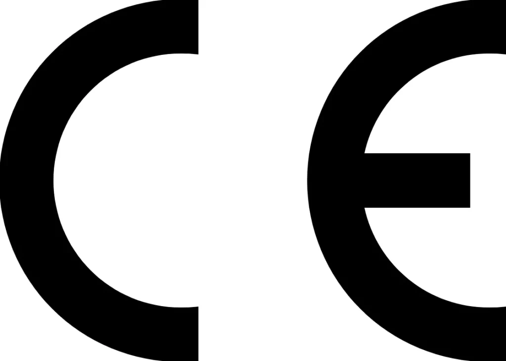
The European Community (EC) symbol — not to be confused with China Export — shows that the manufacturer claims that its product is safe and complies with all EU standards.

The recycling symbol or Möbius Circle indicates that the packaging has been made from recycled materials.

The FSC symbol guarantees that the packaging material comes from a responsibly and sustainably managed forest. There are three types of certification: FSC 100%, FSC recycled and FSC mixed, each used according to the origin of the materials.
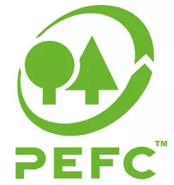
The PEFC symbol, like the FSC symbol, also certifies that the raw material comes from sustainably managed forests. The difference between the two symbols lies in the organisations that promote each of them: Greenpeace and WWF in the case of FSC and PEFC (Programme for the Endorsement of Forest Certification) in the case certification under the same name.
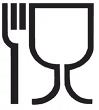
The cup and fork symbol indicates that the container will contain food.
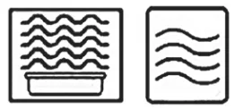
The square symbol with waves inside indicates that the package is microwaveable.
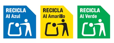
Packaging may also include information on subsequent recycling. These symbols facilitate responsible waste management after the packaging has served its purpose.
These, among many others, are some of the symbols that enhance the user experience through information.
Ergonomic design: easy to carry
Ensuring that it is easy to open, close and transport is also one of the keys to accessible packaging.
Today, many elderly or mobility-impaired people find it difficult to handle certain products, and as manufacturers our role is key.
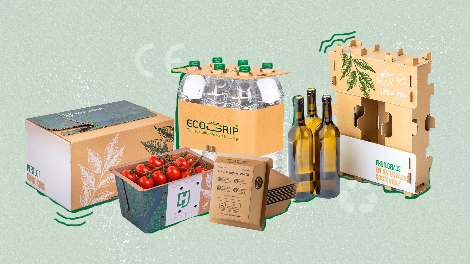
With handles such as those on our fruit and vegetable trays or lightweight packaging such as Halopack, we make it easier to transport products from the supermarket to the home.
In addition, we also have easy-to-use, tear-to-open models designed specifically for e-commerce that provide the option of returns using the same packaging.
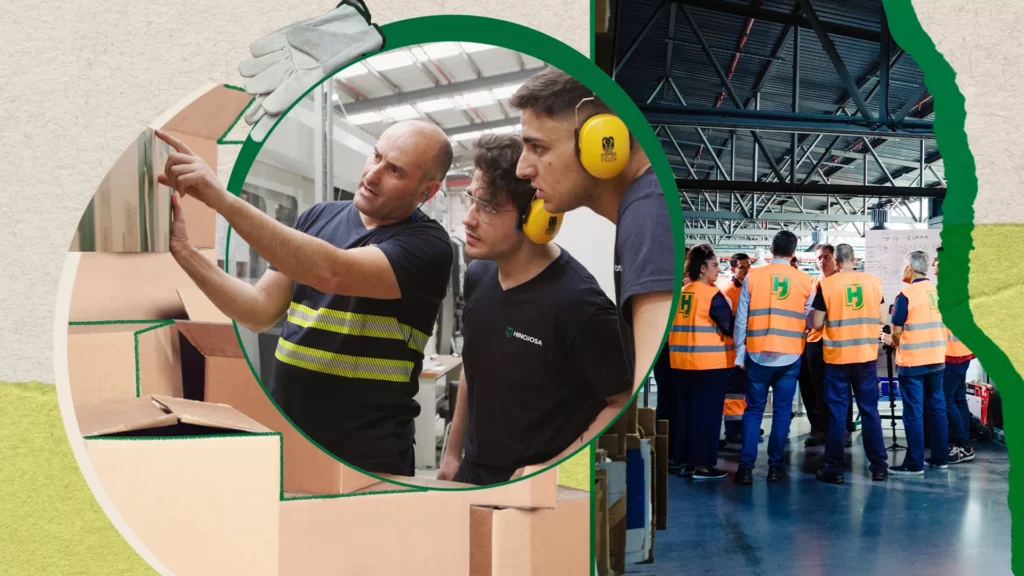
Hinojosa for accessible packaging
Aware of the importance of facilitating purchase and consumption through packaging, we at Hinojosa work with an innovation model focused on people and the planet.
Our solutions, in addition to having an ergonomic and lightweight design that facilitates their transport and usability for all audiences, are made with recyclable and sustainable materials that reduce the carbon footprint of the brands that trust us.
Furthermore, the choice of materials allows them to be easily customisable, including information on all sides in a way that is transparent to the consumer.
As #CircularNatives committed to the customer, our goal is to continue working to improve our packaging. We always take into account the latest needs of the planet and of consumers who are increasingly thinking about the impact that certain processes have on the environment. In fact, as we mentioned in the article on consumer demands in the 21st century, this percentage has already reached 84% (Brands with Values, 2024.)
What does the future hold?